Sponge Microgrid App Version 1
User Research, UX and UI Design
Contents
During my User Experience studies at York University, I worked with Sponge Microgrid, a company focused on green energy management software. Our group was tasked with designing an app to help users manage and optimize their energy consumption. This app was to be used on the Sponge EMC (a touch screen tablet that was mounted near the user’s power source), mobile devices, and desktop.. After completing the course, I joined Sponge as an employee.
The Problem
The challenge for this project was finding a way to create a user-friendly interface that appeals to both consumer users and the technicians that will be installing and maintaining the product.
User Personas


User Research
Research Goal: To understand the needs users face when using Sponge’s software, as well as understanding how technicians might efficiently use the Sponge app when maintaining and installing the device.
Heuristic Analysis

Competitive Review

Interviews
Interviews were set up between 5 users. These users consisted of two technicians, a pre-existing Sponge user, and two users interested in using the app. When conducting the interview, users brought up four main topics:
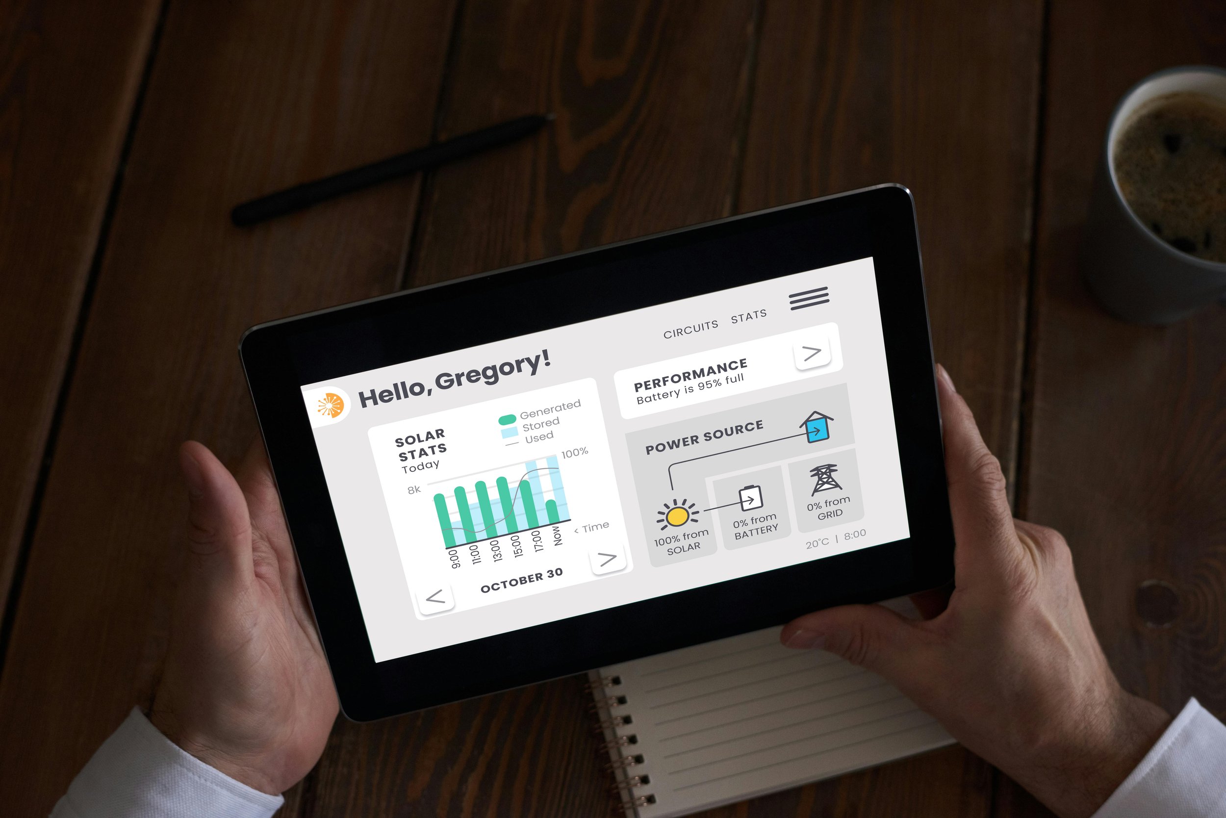
Communicating the Functions & Information: Participants highlighted the need for clear communication and easy-to-understand visuals. Users wanted better insights into power usage, battery levels, system status, and solar efficiency. Stakeholders emphasized presenting data uniquely and in a digestible format.
UI Design: Users preferred a simple, minimalist interface with clearly sectioned information for easy navigation. Stakeholders appreciated minimalist designs, similar to Apple products and Google Keep. Accessibility was a major focus, with suggestions for colorblind-friendly options and larger buttons for users with bigger fingers. One user mentioned difficulties with small buttons and frustration with navigating through multiple steps to access key functions.
Convenience: Technicians emphasized the need for an easy-to-navigate interface to help them work more efficiently, suggesting features like auto-fill, auto-suggestions, and interactive gesture controls. Homeowners expressed interest in a mobile app to monitor their devices remotely, especially during situations like power outages, highlighting the importance of staying informed when away from home.
Complications of a Green-Energy Lifestyle: Homeowners discussed the challenges of adopting green energy, citing high costs as a major barrier to starting or expanding their use of sustainable products. While they recognize the importance of green energy, affordability is a key concern. One user suggested more government grants to help reduce costs for consumers. Others pointed out that a lack of public education on green energy also hinders widespread adoption.

“I would like to know more about how everything operates so that if something does go wrong I have a little bit more of an understanding”

“The benefit would be if you’re at work and you know that storms have gone through and you’re not home you can check to see if everything is up and running.”

“It comes down to if it makes sense from a cost perspective. I know it’s important but it also needs to be affordable.”
Wireframes

Low Fidelity

Mid Fidelity

High Fidelity
Usability Testing
Two user testing’s were conducted to identify problem areas in the prototype. One was aimed at home owner users and the other for technicians. The platform Maze was used to record and test users remotely. In order to emulate the EMC tablet, users were highly encouraged to use a touch screen device when participating in the test. The images below show where users interacted with the most.
Note: It was discovered during testing that Maze had technical difficulties when running on mobile.
Key Findings

Drag And Drop Features Were Confusing
Many users did not understand the drag and drop feature and failed to complete task.

Mobile optimization is needed in general for the design. Users requested bigger buttons, bigger type, and clearer way to visually define interactions.
Optimize For Mobile

Users loved the graphs on the dashboard but found certain aspects hard to understand (the dates on the graph).
Graphs On Dashboard Need Revising

Declutter Dashboard
Some users found the amount of information overwhelming.
Final Solution
After discovering the issues presented from the results of the user tests, a series of adjustments were made on the prototype. The changes that were made included:
Popup Instructions: Prompts with instructions on how to use the drag function on the loads page were implemented in order to avoid confusion. These prompts would appear when users open the load page for the first time.
Simplifying Graphs and Dashboard: The graphs on the dashboard were simplified and the formatting of the dates were updated. Additionally,

Next Steps and Learnings
The next step for the Sponge app is to conduct a follow-up usability test to evaluate whether the recent changes effectively addressed the issues identified in the initial test.
In addition, new pages, including the Help Guide, Account, Security, and Settings, need to be designed and implemented. Due to the course timeline, only the Dashboard, Load, and Login/Account setup pages were developed for the EMC. A mobile version of the app also needs to be designed, developed, and tested to ensure a seamless user experience across devices.