Sponge Microgrid Website
UX and UI Design
Contents
Sponge Microgrid is developing a software that helps manage renewable energy utilizing predictive data from weather forecasting and user’s previous energy consumption . Recognizing the need for a more effective online presence, I undertook a comprehensive redesign of the Sponge website. This redesign aims to clearly communicate the company’s mission and product offerings, enhancing user engagement and facilitating easier access to information and purchasing options.
The Problem
The existing Sponge website failed to fulfill its intended goals, as the design did not effectively communicate what Sponge offers and how it benefits users. Furthermore, it lacked functionality for customers to easily purchase products or inquire for more information, hindering potential sales and engagement.
Wireframes

Low Fidelity

Mid Fidelity
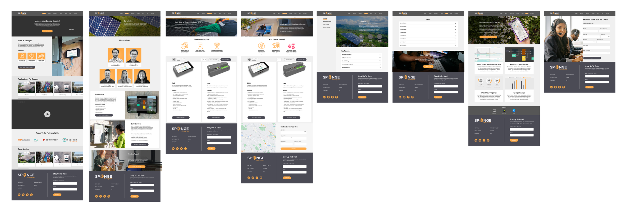
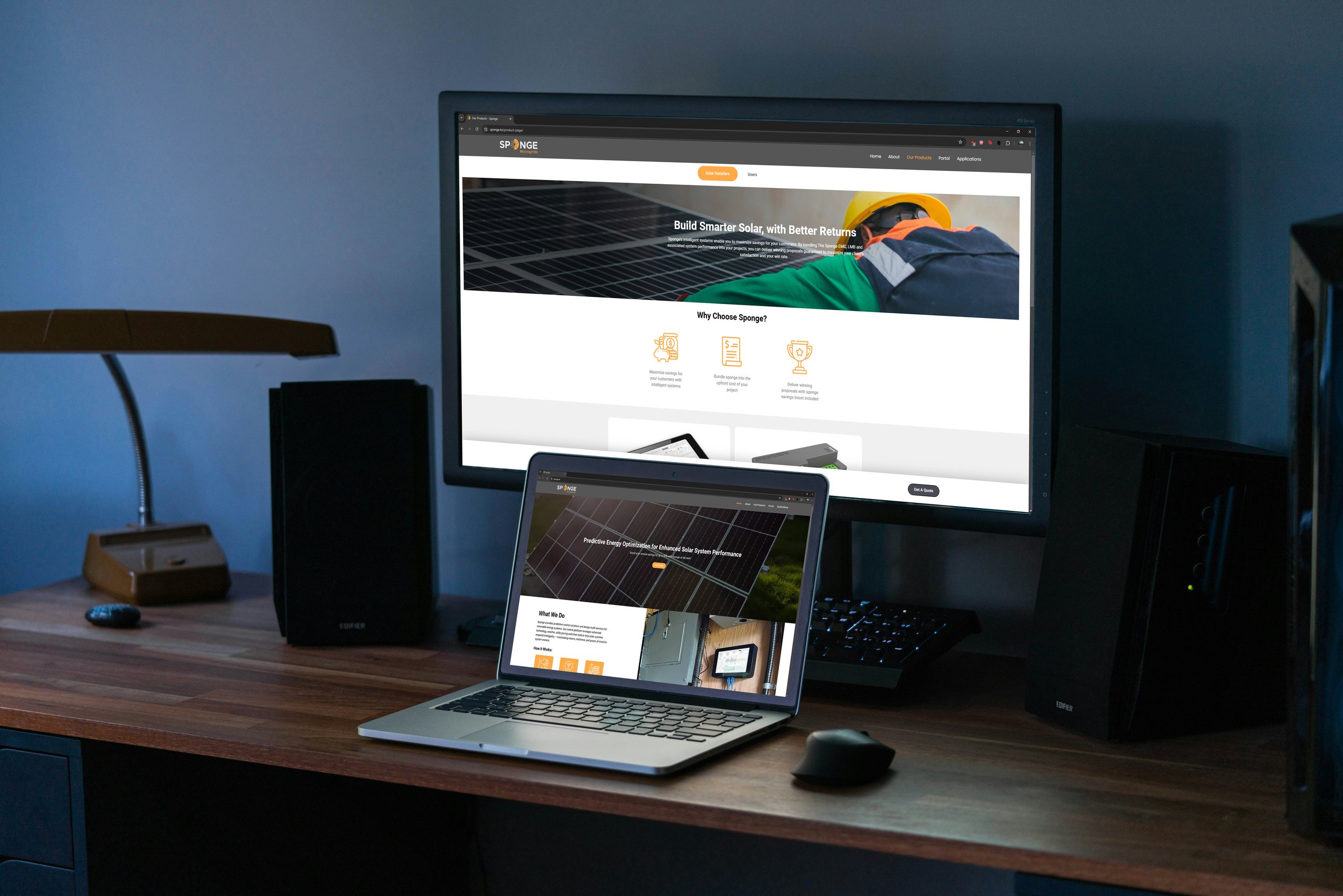
High Fidelity
Final Solution
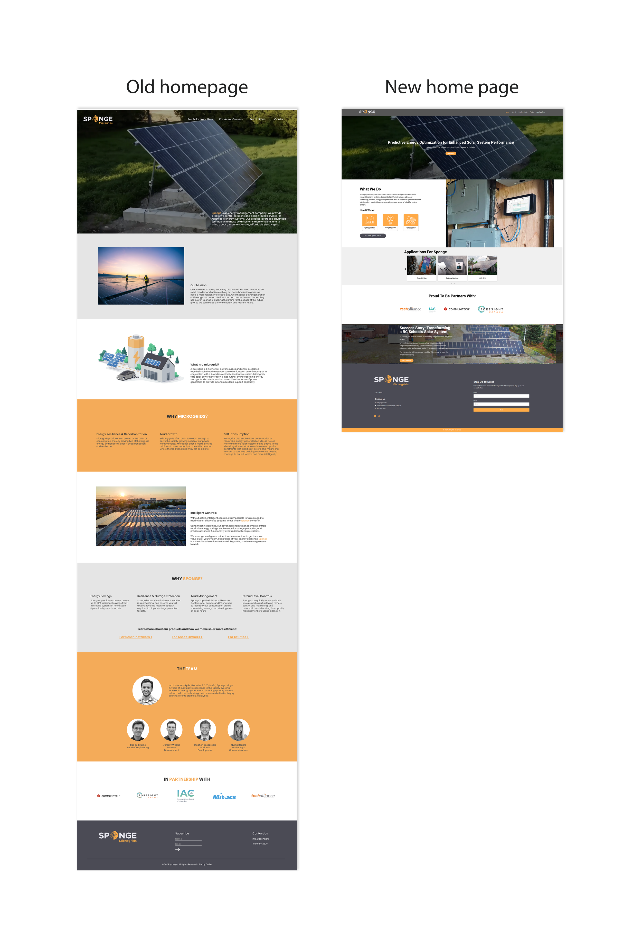
In the final redesign of the website, several strategic changes were made to enhance user engagement and streamline navigation. This comprehensive redesign focused on making the website not only more functional but also more intuitive, driving user engagement and reinforcing the company's brand presence
Call-to-Action Enhancements: We added prominent call-to-action statements and buttons to the homepage, encouraging users to explore the company’s offerings. These CTAs lead visitors to key areas of the site, increasing interaction and guiding them through a seamless journey from curiosity to conversion.
Highlighting Past Projects: To make it easier for users to understand what the company does, we incorporated case studies of completed projects directly on the homepage. This provides a clear snapshot of the company's capabilities, allowing potential clients to quickly grasp the value of its services.
Dedicated Sponge App Page: A new page was created specifically for the Sponge app, providing an in-depth explanation of what it is, how it works, and its benefits. A portal button was added to this page, allowing users to directly access the app from the site, offering a smooth transition from learning about the app to using it.
Sticky Pop-Up on Product Page: To further enhance the user experience and boost product discovery, a sticky pop-up was introduced on the product page. This pop-up offers timely suggestions or promotions, ensuring visitors stay informed and engaged while browsing the product offerings.
Next Steps and Learnings
As the company continues to grow, several key developments are planned to further enhance the website’s functionality and user experience:
E-commerce Integration: While the current site directs users to fill out a quote sheet, we plan to integrate a full e-commerce solution as the company expands. This will allow users to make purchases directly through the site, simplifying the buying process and catering to a larger, more diverse audience.
Partnered Installers Section: To strengthen the company's network and improve customer service, we will add a dedicated section for partnered installers. This feature will enable users to easily find installers in their area, with contact information and location details to ensure a smooth connection between customers and certified partners.
FAQ Page: A new FAQ page will be introduced to provide clear answers to common questions, reducing potential friction and ensuring users have all the information they need. This page will serve as a go-to resource for quick, reliable solutions to frequently asked queries.
User Interviews for Continuous Improvement: To keep the website evolving and aligned with user needs, we will conduct interviews to gather feedback on the site’s performance and usability. These insights will guide future updates, ensuring we continually improve the user experience.