Sponge Microgrid App
Version 2
UX and UI Design
Contents
Sponge Microgrid is a Canadian company specializing in software that optimizes and manages renewable energy systems. By analyzing predictive data such as weather forecasts and historical energy usage, Sponge’s platform intelligently controls energy distribution and storage, ensuring efficient and sustainable energy management.
The Problem
Sponge Microgrid is in the process of developing a smart renewable energy management software and requires a streamlined approach to integrate newly proposed features and data visualizations. The challenge is to design an intuitive, user-friendly interface that effectively incorporates these updates while maintaining usability and clarity for users managing their energy systems.
User Personas


Research Keypoints
User research from Sponge App version 1, involving interviews with five participants (technicians, stakeholder, and users), revealed five key insights. Due to time constraints and continuity from version 1, this research was applied to Sponge version 2. Below are the themes that were discovered from the interviews:
Convenience
Technicians wanted a user-friendly interface with features like auto-fill, suggestions, and gestures for efficiency. Homeowners sought a mobile app for remote device monitoring, especially during power outages, to stay informed.
Complications Of A
Green-Energy Lifestyle
Homeowners cited high costs as a major barrier to adopting or expanding green energy use. While they see its importance, affordability remains a key concern.
Communicating The Functions & Information
Participants emphasized the need for clear communication and simple visuals, with users seeking insights into power usage, battery levels, system status, and solar efficiency. Stakeholders wanted data presented uniquely and accessibly.
UI Design
Users favored a minimalist, clearly sectioned interface for easy navigation. Stakeholders liked designs similar to Apple and Google Keep, emphasizing accessibility with colorblind-friendly options and larger buttons. One user noted frustration with small buttons and lengthy navigation for key functions.
Wireframes

Low Fidelity

Mid Fidelity

High Fidelity
Final Solution
Building on user research from Sponge App version 1 and incorporating newly proposed features, we implemented several innovative solutions, including:
Diagram Builder: This design aimed to let users easily build, edit, and test electrical systems. A lock button was suggested to prevent accidental changes, along with a help button at the top for instructions on using and editing components.
Showcasing KPIs: To help users quickly understand their Sponge system's impact, key KPIs were added to the top of the dashboard for easy access. Users could tap each KPI for a more detailed report.
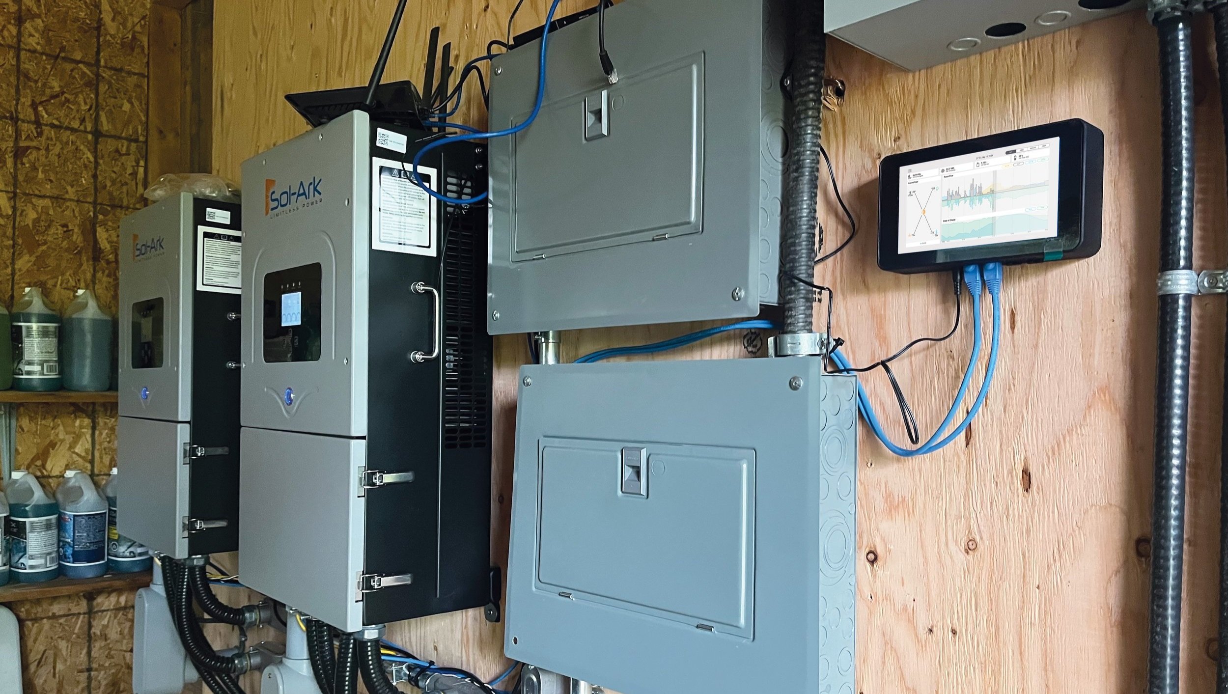
Simplifying The Control Diagram: Simple animations showed energy flow direction, and system status was indicated at the bottom in green (online) or red (offline) for clarity.
Line Charts: Line charts were chosen to handle the large volumes of data users needed to analyze. They effectively display trends over time, allowing users to quickly identify patterns in metrics like energy consumption and system efficiency. This clear format enables users to easily analyze historical data and make informed decisions, enhancing their control over the system.

Next Steps and Learnings
Due to time constraints, user testing was not conducted for this phase. Moving forward, we plan to conduct interviews with users who have interacted with the new Sponge App to gather valuable feedback on their experiences. Additionally, we will create and test a mobile version of the app to enhance accessibility and usability for a broader audience. We also aim to explore and implement accessibility features to ensure our solutions are inclusive and cater to all users. These steps will help refine our offerings and ensure they effectively meet user needs.